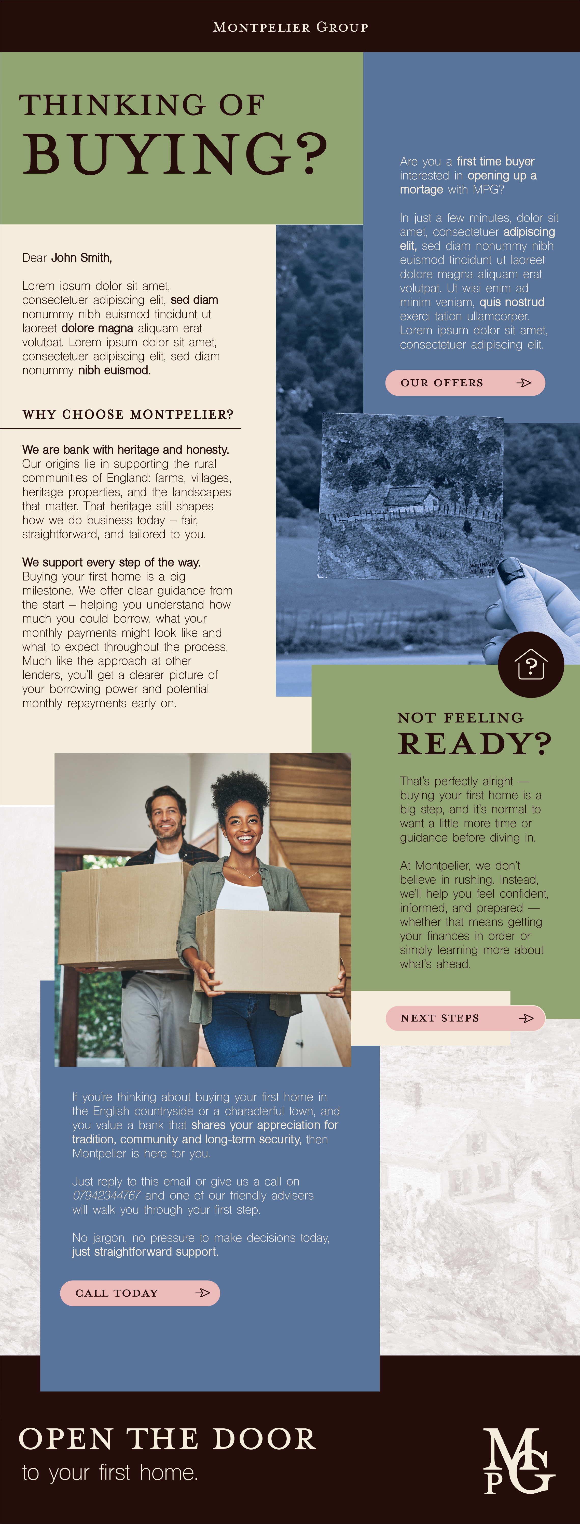
Montpelier Group is a conceptual rebrand of a traditional English bank with deep roots in rural life, agriculture, and heritage protection. This self-initiated project explores how a financial institution can feel both established and empathetic, a trusted presence that values the land, community, and continuity.
Drawing inspiration from the timeless elegance of the National Trust and the quiet confidence of British heritage brands, Montpelier Group positions itself as a modern steward of financial wellbeing. The visual identity and tone of voice blend heritage craftsmanship with contemporary clarity, appealing to first-time buyers and lifelong homeowners alike who seek substance, sincerity, and a sense of place.
This project showcases my ability to craft brand worlds that feel lived-in, layered, and emotionally resonant. Where every design decision reinforces a brand’s story, purpose, and enduring values.

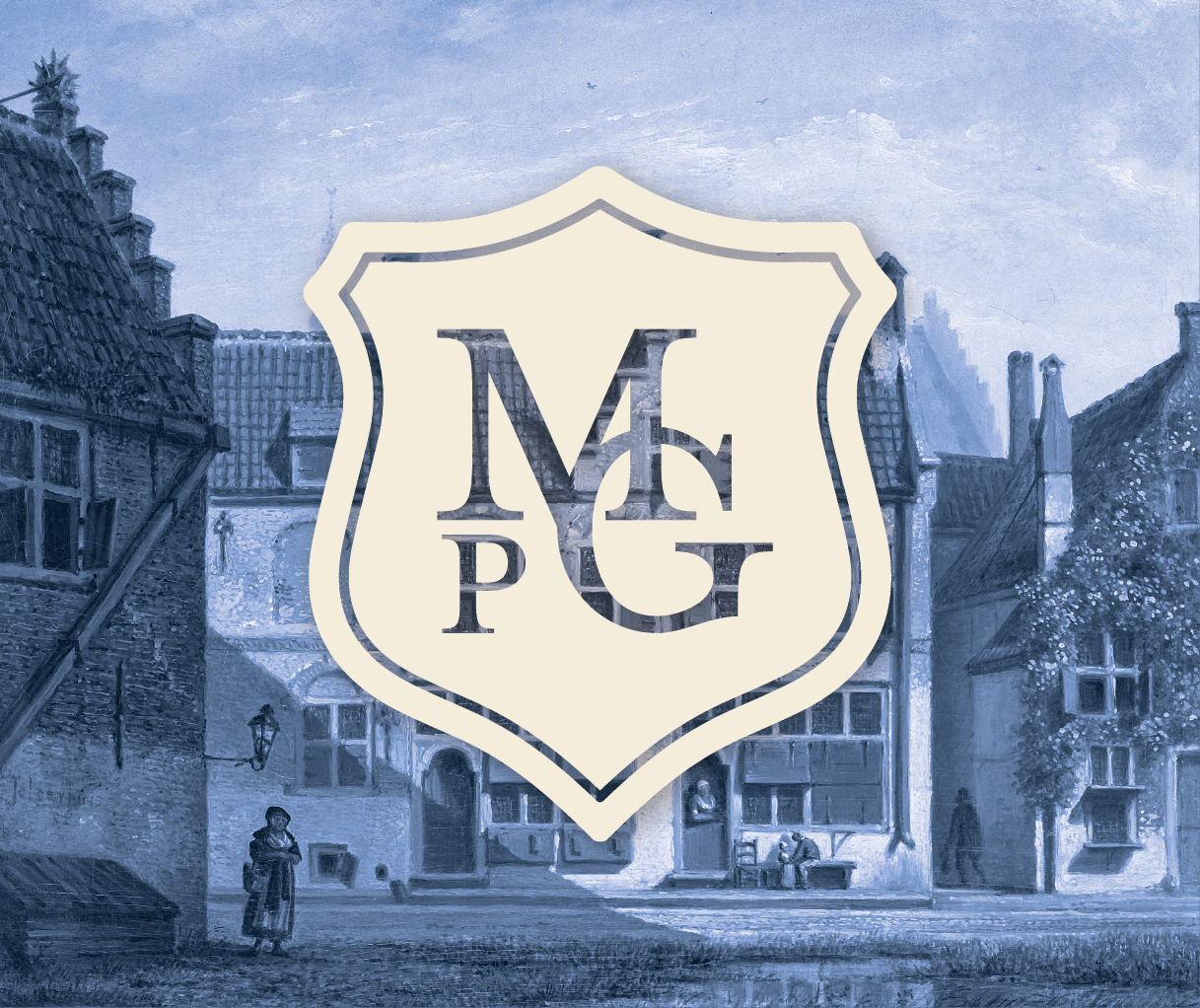
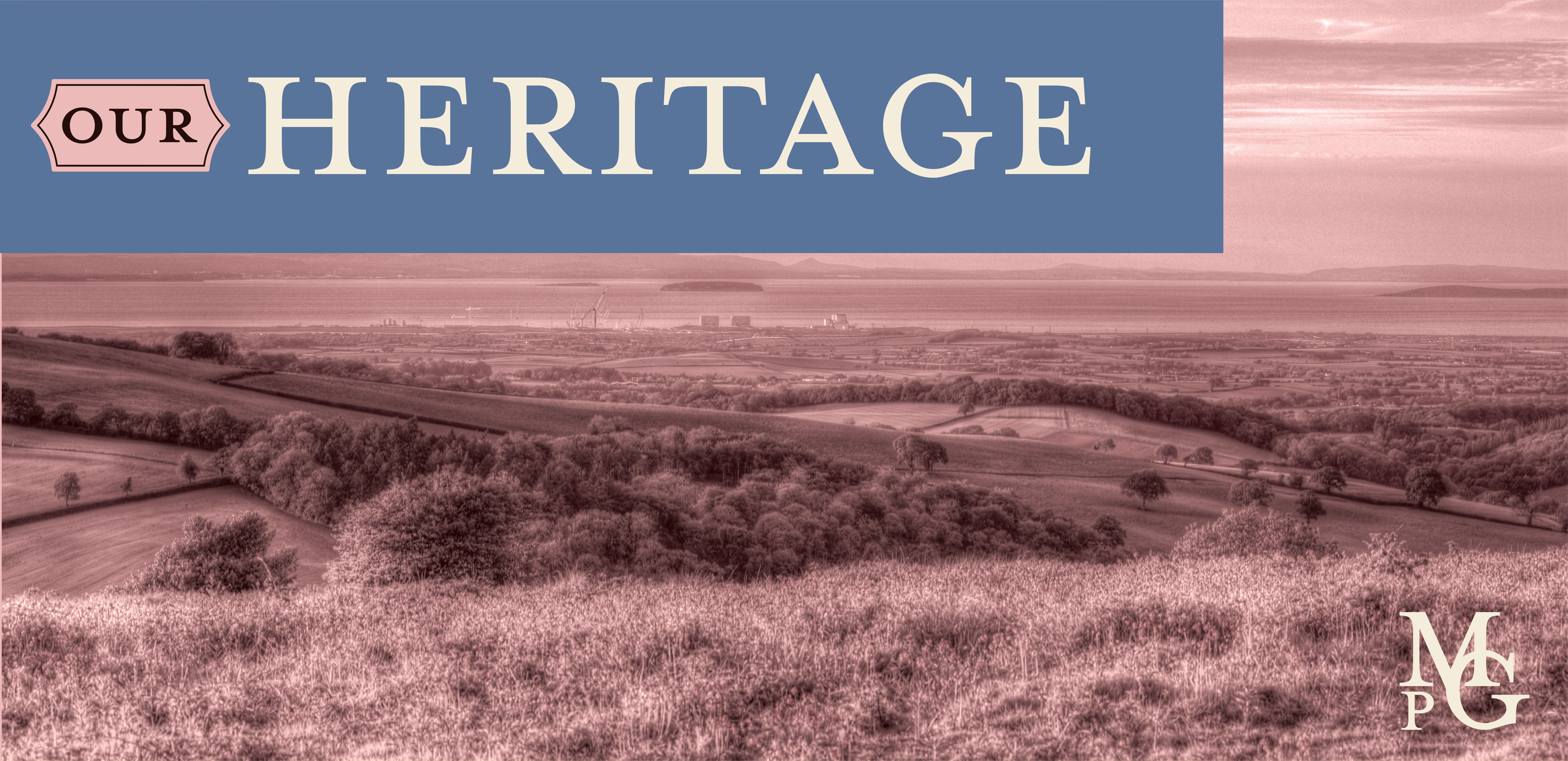
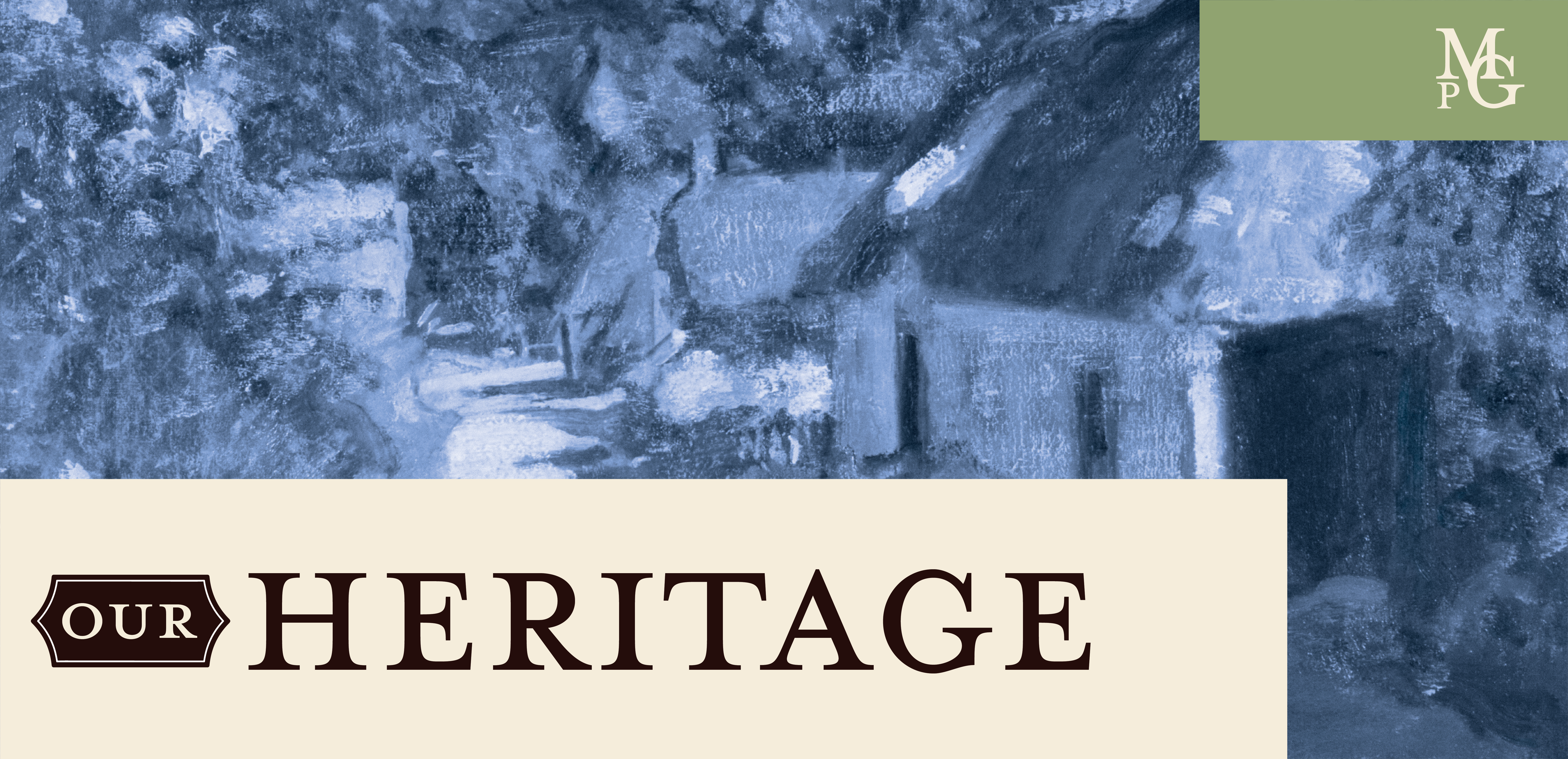
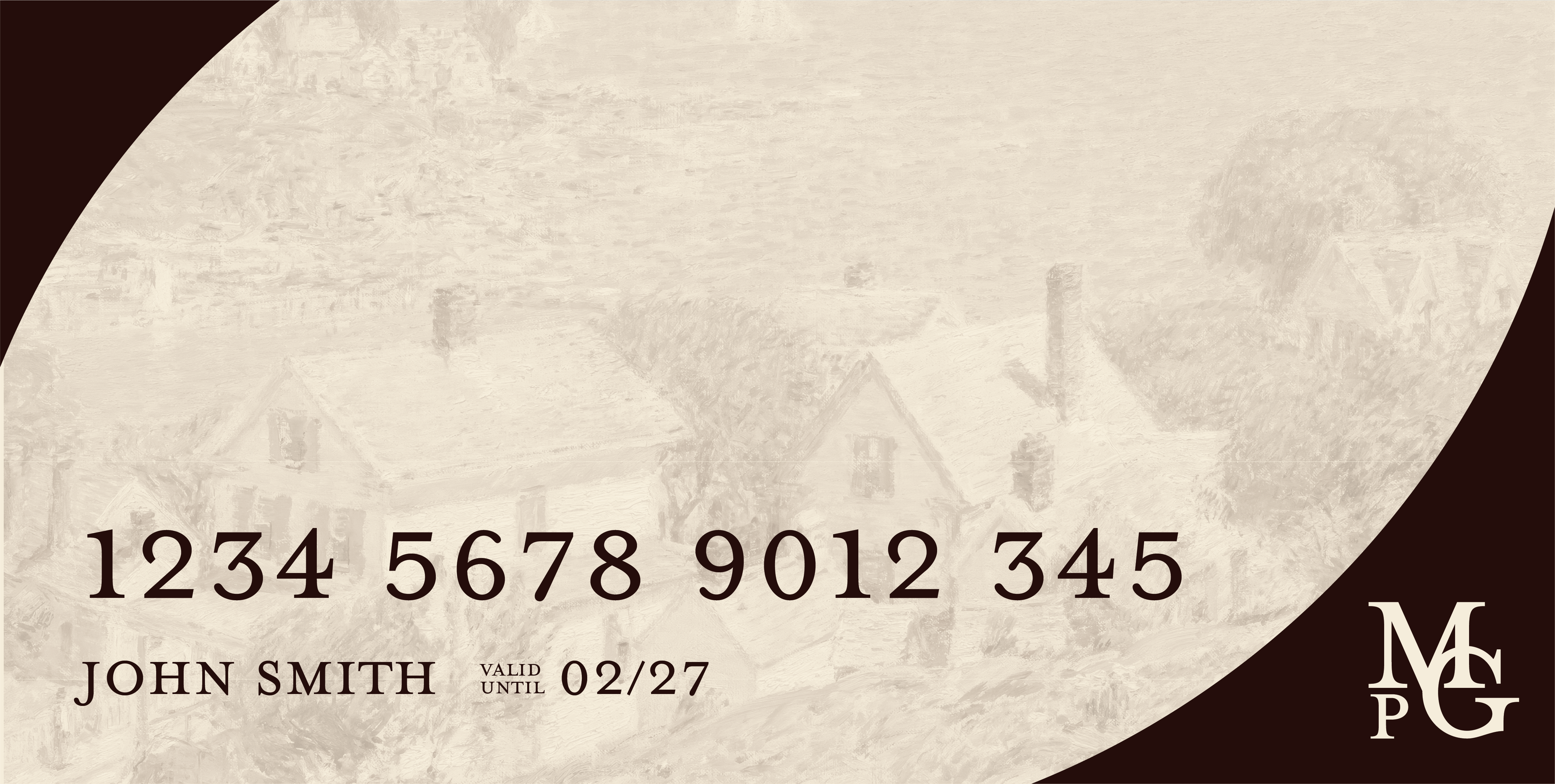
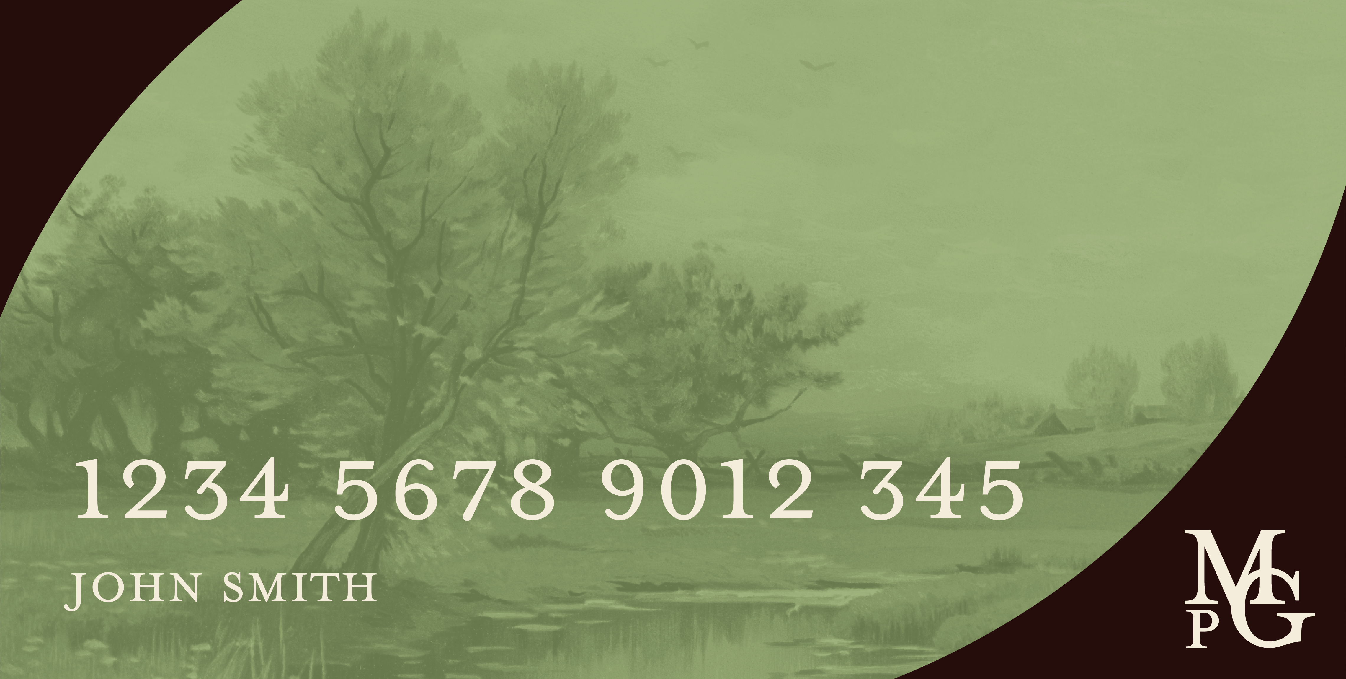
The visual identity for Montpelier Group was crafted to evoke the quiet confidence of an established countryside institution — traditional yet deeply human. The palette draws on earthy greens, muted blues, and warm leather browns, reflecting the landscapes and heritage architecture that inspire the brand.

Typography balances elegant serif forms with generous spacing and soft contrasts, bringing a sense of timeless clarity to financial communications. A bespoke crest-style monogram reinforces stability and lineage, while painterly textures and archival imagery ground the design in a sense of place and preservation.
Across printed and digital touchpoints, from comms/email design to business stationery, Montpelier’s brand world communicates trust, care, and continuity — qualities that bridge the distance between legacy banking and modern homeownership.
Montpelier Group was my exploration of how heritage can feel human again. It’s an imagined brand, but one grounded in real values: trust, care, and a slower, steadier approach to finance.
This project let me play in that quiet space between old and new — pairing traditional cues with a softness that feels more personal than institutional. It’s about showing that even in the most conventional sectors, design can create warmth, belonging, and a sense of story.
Mostly, though, it’s a love letter to the English countryside — and the belief that timeless design doesn’t need to shout to be heard.